📊
Analytics and forecasts
The "Analytics" tab group: charts, heatmaps, venue comparison, records, beverages, price seasonality and the forecast hub — what every screen shows and where the numbers come from.
1
Charts: four modes
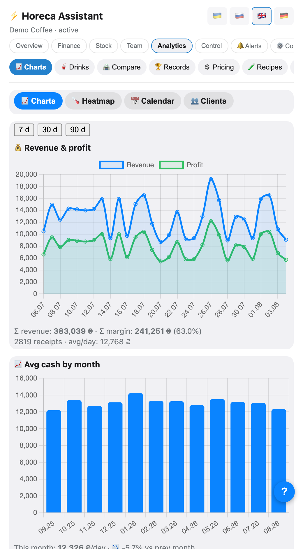
The Analytics → 📊 Charts tab. The main mode holds four charts over 7/30/90 days: revenue and profit per day (with total till, margin and daily average below), average till per month (plus a per-venue split when there are several), per venue (revenue and profit) and traffic by hour and day of week.
The chips at the top switch three more modes: 🌡 Heatmap — a day-of-week × hour grid where a darker cell means more revenue (30 days); 📅 Calendar — 3 months of days, darker = more; 👥 Clients — regulars via loyalty cards: top by visits and "have not been in a while".
The chips at the top switch three more modes: 🌡 Heatmap — a day-of-week × hour grid where a darker cell means more revenue (30 days); 📅 Calendar — 3 months of days, darker = more; 👥 Clients — regulars via loyalty cards: top by visits and "have not been in a while".
💡 In "Clients" the bot warns honestly when the loyalty card is scanned in less than half of receipts — the analytics then covers only part of your guests, and a banner on the screen says so.
2
Prices/margin: seven tools in one
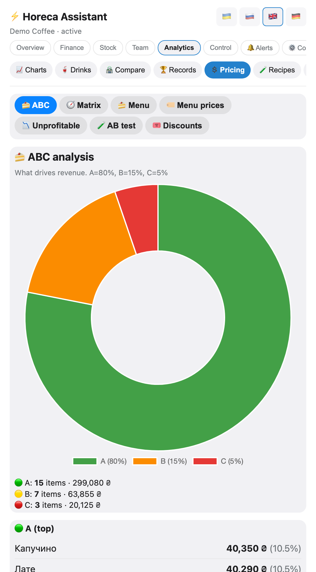
The 💲 Prices/margin tab is a hub with chips: 🥇 ABC (items by revenue contribution), 🧭 Matrix (menu engineering: every item is a Star / Plowhorse / Puzzle / Dog by popularity × margin, with a concrete suggestion), 📋 Menu (every item with its markup), 💲 Prices (the weekly price review), 📉 Loss-makers, 🧪 A/B (log a price change — the bot compares sales before/after) and 🎁 Discounts (who gives discounts and how often).
3
Beverages: segments and comparison
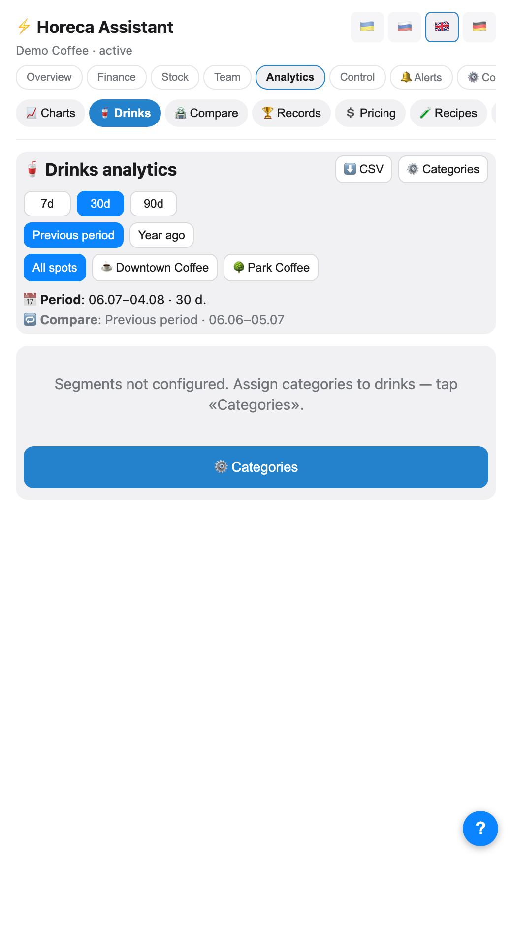
The 🥤 Beverages tab: sales by segment ❄️ cold / ☕ coffee / 🍹 other — units and revenue, each number with a Δ% badge against the previous period or the same period a year ago (switchable). There is a venue filter, and tapping a category drills into its items with the same comparison.
Which Poster categories fall into which segment is configured by the owner via ⚙️ on the same screen.
Which Poster categories fall into which segment is configured by the owner via ⚙️ on the same screen.
4
Venue comparison
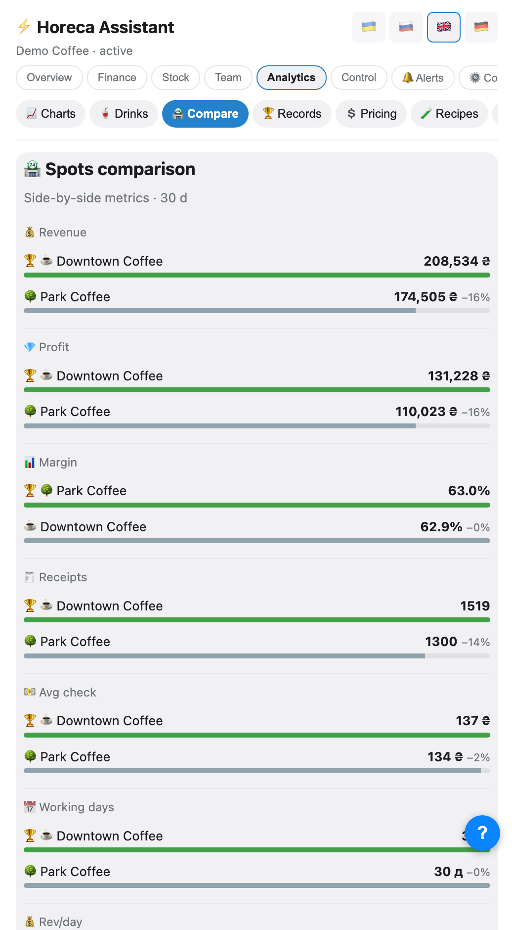
The 🏪 Comparison tab (needs 2+ venues): eight metrics over 30 days side-by-side — revenue, profit, margin, receipts, average receipt, working days, revenue/day and receipts/day. Each metric marks the leader with 🏆 and shows how far the others trail in percent.
5
Records
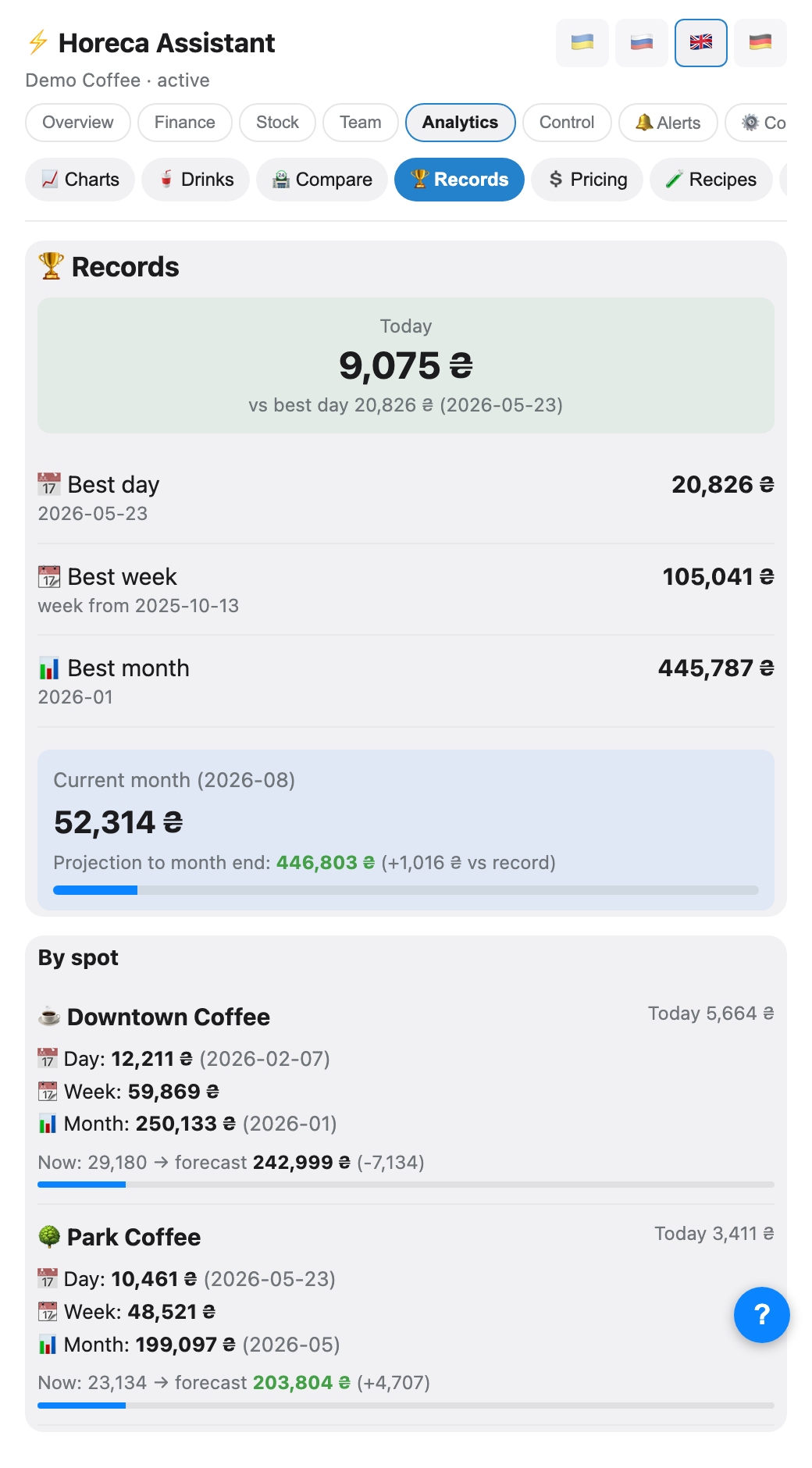
The 🏆 Records tab: today's till against the daily record, the best day / week / month in history, and — the main part — the current month with a projection to month end: green when the pace beats the record, with the gap in currency. With several venues, the same layout repeats per venue.
6
Purchase-price seasonality
The 🌡 Season tab: from your own supply history the bot finds which ingredients get pricier in which months ("milk: October +4.2%"), plus the most volatile items (±% price swing). Below is an ingredient × month heatmap.
It needs at least 6 months of supply history per ingredient — with too little data the screen shows diagnostics: how many ingredients appear in supplies and how many have enough history.
It needs at least 6 months of supply history per ingredient — with too little data the screen shows diagnostics: how many ingredients appear in supplies and how many have enough history.
7
The forecast hub: tomorrow, month, weather, balance
The 🔮 Forecast tab has five modes: Forecast (tomorrow + 7 days ahead, per venue), Month forecast (the month's outcome at the current pace), Forecast+ (the advanced model), Weather (5 days + the weather↔revenue correlation from your own history) and Balance forecast (account cashflow for the coming days).
Each forecast shows what the number is made of — factor badges: 🎉 holiday, 💸 payday, 🌧/☀️ weather adjustment, 🚨 air-raid alerts, ⚖️ calibration from past misses.
Each forecast shows what the number is made of — factor badges: 🎉 holiday, 💸 payday, 🌧/☀️ weather adjustment, 🚨 air-raid alerts, ⚖️ calibration from past misses.
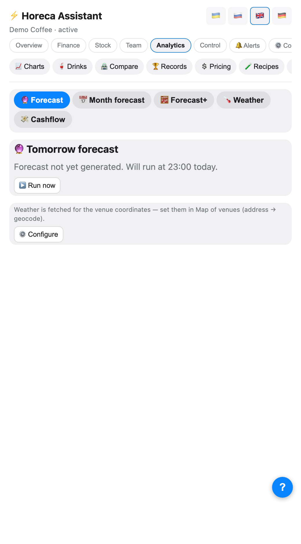
💡 The forecast regenerates itself nightly at 23:00. How accurate it is shows in the accuracy log (MAPE) right inside the "Forecast" mode: the bot records the prediction and the actual for every day.
⚠️ The weather and air-raid factors need the venue's coordinates — set the address in "🌍 Venue map" (the "Company" group), otherwise those adjustments are skipped.
8
Idle hours
The 😴 Idle hours tab is a text report: at which hours a venue consistently makes zero or near-zero revenue. It is the argument for schedule decisions: open later, close earlier, or staff one barista instead of two through the dead hours.
FAQ
Who sees the analytics?
Charts — anyone with the
tab_charts right (by default the owner, admin, manager and accountant). Every other screen in the group — Beverages, Comparison, Records, Prices/margin, Seasonality, Forecast, Idle hours — sits behind tab_finance: by default that is also the owner, admin, manager and accountant, while a barista does not see them.The forecast is empty or says "not generated yet"
A new company's first forecast appears after the nightly generation (23:00) — or immediately via the "Run now" button on the screen. If the numbers look odd after that, the model simply has little history yet: it learns from your own weeks of sales.
"Comparison" says it needs two venues
That is by design: a single venue has nothing to compare against. The screen comes alive as soon as the company gets a second venue (it syncs from Poster automatically once added there).